Moreover, the Google Gemini logo has become one of Google’s most recognizable AI symbols.
Additionally, its colorful spark represents Gemini across apps, websites, and Google services.
The design has also changed slightly as Google’s AI products have grown.
Google refreshed the Gemini visual identity during 2025 and 2026.
The changes focused on brighter colors, stronger gradients, and a cleaner appearance. (Google Blog)
In addition, the latest changes are subtle.
You might miss them when looking at the icon on a small phone screen.
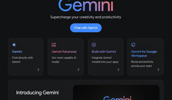
What Is the Google Gemini Logo?
The google gemini logo is commonly shown as a four-pointed, colorful spark.
Google officially calls this shape the “Gemini spark.”
The symbol uses colors associated with Google’s wider visual identity.
These include blue, red, yellow, and green.
The icon appears across several Gemini experiences.
You can see it in mobile apps, desktop software, websites, and other Google products.
Google has continued expanding Gemini across its ecosystem.
In May 2026, Google introduced Gemini 3.5 and new agentic experiences. (Google Blog)
“Gemini spark” is the name Google uses for the visual symbol.
The design therefore isn’t just an app icon.
It represents a larger family of Google’s artificial intelligence products.
Why Did Google Change the Gemini Icon?
Google has been updating its visual system as Gemini becomes more important.
In September 2025, Google said its brighter gradient “G” would represent the whole company.
Google also explained that the Gemini spark received the brighter treatment earlier that year. (Google Blog)
Then, in May 2026, Gemini received another small icon adjustment.
The blue area became slightly smaller.
Red, yellow, and green became more visible.
The colors also became more solid and vibrant.
The overall spark shape stayed the same. (9to5Google)
“A touch more colorful” describes the 2026 Gemini icon update.
This approach makes sense for a growing AI brand.
Google can refresh the icon without making users relearn the symbol.
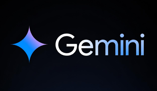
Google Gemini Logo Colors Explained
The google gemini logo uses a colorful visual style that connects with Google’s broader branding.
However, Gemini has its own personality.
The spark feels more dynamic than the traditional Google “G” symbol.
Here is a simple breakdown of its visual colors:
| Color | Visual role | General impression |
|---|---|---|
| Blue | Main cool tone | Technology and trust |
| Red | Warm contrast | Energy and creativity |
| Yellow | Bright highlight | Optimism and ideas |
| Green | Supporting tone | Freshness and balance |
These colors can change slightly depending on the icon version.
The exact appearance can also differ because of gradients and display settings.
Google’s broader logo update introduced brighter four-color gradients in 2025.
The company connected those colors with AI-driven innovation and creative energy. (Google Blog)
So, the Gemini design fits naturally into Google’s newer visual language.
How Has the Gemini Logo Changed?
The google gemini logo has gone through several visual stages.
The current spark is cleaner than earlier versions.
It also uses stronger color contrast.
A notable 2026 change appeared around Google I/O.
The spark became slightly larger within the app icon.
Its blue area was reduced while other colors became more visible. (9to5Google)
| Period | Main visual direction | Key change |
|---|---|---|
| Earlier Gemini branding | Multicolor spark | Introduced the Gemini identity |
| 2025 | Brighter gradient style | Stronger connection with Google branding |
| 2026 | More vibrant spark | More visible red, yellow, and green |
| Current direction | Unified AI identity | Used across expanding Gemini products |
Actually, scratch that if you’re expecting a dramatic redesign.
The 2026 change is more of a refinement than a complete replacement.
That detail matters for designers.
Small differences can affect thumbnails, social graphics, and brand assets.
Where Can You See the Gemini Spark?
The symbol appears in many places across Google’s AI ecosystem.
For example, Gemini is available through mobile and desktop experiences.
Google also continues expanding Gemini into different products and services.
In September 2026, Google launched the Gemini app for Windows.
Users can summon it with the Alt + Space shortcut. (Google Blog)
The desktop app also connects Gemini with Google apps.
Users can work with information from Gmail and Google Drive.
It can also create images using Nano Banana. (Workspace Updates Blog)
“Alt + Space” gives Windows users quick access to Gemini.
This expansion makes the spark more recognizable.
Users can now encounter Gemini in more parts of their daily workflow.
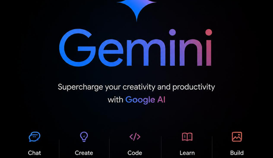
Best Uses for the Gemini Logo
If you’re creating content about Gemini, the icon can make your design instantly recognizable.
However, don’t stretch or distort the symbol.
A clean logo usually looks better than an oversized graphic with too many effects.
Here are useful places to feature it:
- YouTube thumbnails about Gemini
- Blog article featured images
- AI tutorial graphics
- Social media posts
- Presentation slides
- Technology comparison graphics
For thumbnails, place the spark near the main headline.
Keep enough empty space around it.
Also, avoid covering the icon with text.
Small logos lose clarity quickly when too many elements overlap.
Google Gemini Logo for Content Creators
The google gemini logo can work especially well in AI-related content.
For example, imagine a thumbnail saying:
“Gemini 2026: What’s New?”
A colorful spark beside the headline can immediately establish the topic.
For a blog image, you could use the spark with a laptop illustration.
You could also combine it with Google’s interface style.
Still, avoid making your design look officially produced by Google.
Your graphics should clearly remain your own content.
A friend who runs a small bakery recently started using AI tools for marketing.
She found that simple AI-themed visuals performed better than crowded designs.
That small example shows why recognizable symbols can help people understand content faster.
Ever noticed how quickly you recognize an app from its icon alone?
How to Get a Gemini Logo
If you need the official brand asset, use Google’s own brand resources whenever available.
Avoid downloading random copies from image websites.
Random files may have poor quality or incorrect colors.
They may also contain unwanted backgrounds or compression artifacts.
For design work, check these points first:
- Use an official source when possible.
- Choose a high-quality file.
- Keep the original proportions.
- Avoid unnecessary filters.
- Don’t recreate the colors from memory.
- Check usage rules before commercial use.
The official Gemini website and Google brand resources are better starting points than random image downloads.
Is the Gemini Logo Free to Use?
The google gemini logo is Google’s branding.
That doesn’t mean every use is automatically allowed.
Personal educational content may have different considerations from commercial advertising.
You should check Google’s current brand guidelines before using the symbol commercially.
For example, don’t make a product look like it is officially endorsed by Google.
Also, don’t modify the logo in ways that could confuse viewers.
When in doubt, use the logo only for accurate references.
Keep your own branding clearly separate.
“Gemini” is also the name of Google’s AI model family.
That distinction matters because the logo represents more than one app.
Gemini’s Growing Visual Identity in 2026
Gemini is becoming a much larger part of Google’s product strategy.
At Google I/O 2026, Google introduced Gemini 3.5 Flash and Gemini Omni.
The company also introduced new agent experiences and a redesigned Gemini interface. (Google Blog)
Google described the redesigned interface as “Neural Expressive.”
It includes vibrant colors, fluid animations, new typography, and interactive elements. (Google Blog)
Google also reported more than 900 million monthly Gemini users in May 2026.
The service was available across more than 230 countries and 70 languages at that time. (Google Blog)
That growth gives the visual identity more importance.
A simple spark can now represent a much larger AI ecosystem.
What Does the Gemini Spark Represent?
The google gemini logo represents Google’s Gemini AI family.
Its spark shape suggests intelligence, ideas, creativity, and transformation.
The colorful appearance also connects Gemini with Google’s broader brand system.
Yet the spark remains visually distinct from the classic Google “G.”
That’s useful from a branding perspective.
People can associate the symbol with Gemini without confusing it with Search.
The design is also flexible.
It works on app icons, websites, product interfaces, and promotional graphics.
Frequently Asked Questions
1. What is the Google Gemini logo?
The google gemini logo is a colorful four-pointed spark used to identify Google’s Gemini AI products and experiences.
2. What colors are used in the Gemini logo?
The main visual colors include blue, red, yellow, and green.
Their exact appearance can vary between versions.
3. Did Google change the Gemini logo in 2026?
Yes.
Google made a subtle icon update around May 2026.
The spark became slightly more colorful, with stronger red, yellow, and green areas. (9to5Google)
4. Is the Gemini spark the official icon?
Yes.
Google refers to the visual symbol as the Gemini spark.
5. Where can I use the Gemini logo?
You can reference it when discussing Gemini.
For commercial or promotional use, check Google’s current brand guidelines first.
6. Is the Gemini logo different from Google’s G logo?
Yes.
The Gemini spark identifies Google’s AI products, while the G represents Google more broadly.
Conclusion
The google gemini logo has become an important part of Google’s AI identity.
Its colorful spark is simple, recognizable, and flexible.
The 2026 update didn’t completely redesign the symbol.
Instead, Google made the colors brighter and more balanced.
Gemini is also expanding quickly across apps, models, agents, and desktop experiences.
As that happens, the spark will likely become even more familiar.
For designers and content creators, the main lesson is simple.
Use the official asset, keep it clean, and respect Google’s branding rules.
Pingback: AI Website Builder: Create Modern Websites Faster